Documentation
Getting Started:
- Access Settings:
- Click on the “Settings ” option, which is positioned in the top right corner of your browser.
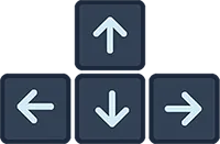
- Alternatively, you can simply press the up arrow key on your keyboard to open the “Settings”.
- Enter Your Address:
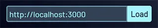
- Once the “Settings” page opens, look for the input field at the top left.
- In this field, enter either your localhost address (starting with http://, for example, http://localhost:3000) or your IP address.
- After entering the address, click the ‘Load’ button.
Web address:
You can also enter the URL of a website, provided it’s not protected by the ‘Same-origin policy’. Please ensure to include https:// at the beginning of the URL (websites that start only with http:// will not load).
ExampleNavigation:
Settings
By default, the site shows ‘Worldwide’ data for the most popular screen resolutions across all platforms (Mobile, Tablet, Desktop). However, you can add or remove specific screen resolutions by clicking the ‘Visible/Hidden’ buttons. The site offers various customizations, and all changes will be saved in your ‘Local Storage’. When choosing which screen resolutions should be ‘Visible’, data and a graph are provided below, showing the sum (∑) of screen width popularity.
Left & Right buttons
Click the arrows to slide through ‘Visible’ screen groups.
Lock position
The ‘Lock Position’ feature allows you to prioritize a specific screen resolution. When enabled, this resolution will always be displayed first, regardless of page reloads or revisits. This is particularly useful when you want to focus on a specific resolution where you’ve identified issues in your project.
Close
If you find the ‘Navigation’ to be distracting, you have the option to hide it.
Keyboard:
Instead of using your mouse, you can always navigate with the arrow keys on your keyboard.
Settings:
- Address:
-
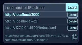
Enter your localhost address (beginning with http://) or your IP
address, then click ‘Load’.
You can also enter the URL of a website, provided it’s not protected by the ‘Same-origin policy’.
Please ensure to include https:// at the beginning of the URL (websites that start only with http:// will not load). - Copy link - You can copy the link if you wish to view your website in a different browser. If your website is already live and not protected by the ‘Same-origin policy’, you can share this link with your co-workers or clients.
-
Enter your localhost address (beginning with http://) or your IP
address, then click ‘Load’.
- Standard & Full Height View:
- Standard View: This view displays the screens with their original widths and heights. It’s perfect for users who want to experience the websites in their standard layouts, just as they were designed.
- Full Height View: This view presents the screens with standard widths but extends to full height. It’s similar to the view you get when you inspect elements on a webpage. The advantage here is that you don’t need to manually adjust your browser’s inner width.
- Countries:
-
By default, the system loads worldwide data for screen popularity.
However, if you’re developing a website for a specific country,
simply click on a link from the list to load data for that
particular country. Currently, we have data and statistics available
for 30 countries. These countries are among those with the largest
GDP globally, making the data particularly relevant for businesses
targeting markets in these regions.
All data is sourced from Statcounter Global Stats.
-
By default, the system loads worldwide data for screen popularity.
However, if you’re developing a website for a specific country,
simply click on a link from the list to load data for that
particular country. Currently, we have data and statistics available
for 30 countries. These countries are among those with the largest
GDP globally, making the data particularly relevant for businesses
targeting markets in these regions.
- Mobile, Tablet, Desktop:
-
By default, the site displays screens for the most popular
resolutions across all platforms (Mobile, Tablet, Desktop). However,
you have the flexibility to add or remove specific screen
resolutions by clicking the ‘Visible/Hidden’ buttons.
In addition, we provide statistics for the popularity of each screen resolution. This can guide you in deciding which screen resolutions should be ‘Visible’. To assist you further, we provide data and a graph below, showing the sum (∑) of screen width popularity for each resolution. This comprehensive data visualization allows you to make informed decisions based on the popularity of different screen widths.
-
By default, the site displays screens for the most popular
resolutions across all platforms (Mobile, Tablet, Desktop). However,
you have the flexibility to add or remove specific screen
resolutions by clicking the ‘Visible/Hidden’ buttons.
- Colors:
- Based on the design of the website you’re working on, you can switch between the ‘Dark’ and ‘Light’ themes. You also have the option to change the background color, border color, and the background color for the status & navigation bar (Mobile & Tablet). All changes will be saved in your Local Storage.
- On/Off:
- Auto-Slide: Use Auto-slider for easy viewing of visible
screens. Adjust the interval by entering your preferred number of seconds.
For the best experience, consider activating ‘Remove loading=“lazy”’ when using Auto-Slider. - Lazy-load: "Lazy-loading of iframe elements defers offscreen iframes from being loaded until the user scrolls near them. This saves data, speeds up the loading of other parts of the page, and reduces memory usage." Source: web.dev/articles/iframe-lazy-loading
- Apply "Fix width" to all screens: If your website (or
just the index page) doesn’t require vertical scrolling because the content
fills the entire screen height, you can apply the ‘Fix Width’ option
to all screens, or only to those that are problematic.
This option is not necessary for the Firefox browser.
Available only with "Standard View" (Mobile & Tablet):
- Border-Radius: The ‘Border-Radius’ option allows you to remove the rounded corners of screens, giving them a more block-like, squared-off appearance. Please note that this change will only affect the appearance on mobile and tablet screens.
- Status & Navigation Bar: The ‘Remove Status & Navigation Bar (Mobile & Tablet)’ option allows you to hide the status and navigation bars on all mobile and tablet screens. This might be useful if you’re developing an app.
- Scale: By default, the ‘Scale’ is set to 1. This means that for screens larger than your browser’s innerHeight, a ‘Scroll’ option is available. However, you can remove the ‘Scroll’ and use the ‘Scale’ option instead. This will adjust the device’s height (and width) to fit within your browser’s innerHeight. Please note, using the ‘Scale’ option may cause the website to appear slightly blurry.
- Auto-Slide: Use Auto-slider for easy viewing of visible
screens. Adjust the interval by entering your preferred number of seconds.
- Reset all custom settings:
- This button allows you to revert all your customized settings back to their default values. When you make changes in ‘Settings’, these changes are saved in your browser’s ‘Local Storage’. Clicking ‘Reset All Custom Settings’ will erase these saved changes from your ‘Local Storage’, effectively resetting your experience on our website to its original state. Use this feature when you want to start fresh or return to the standard setup.
© 2024 M3Web. All Rights Reserved.